Rebecca Mezoff Blog — Rebecca Mezoff

To find your online classes on Pathwright, click HERE.

American Tapestry Alliance

A visit to the minds of six different tapestry teachers...

American Tapestry Alliance's Tapestry Unlimited Blog Tour

The American Tapestry Alliance is trying something new thanks to Janna Marie Vallee of Vancouver Yarn. She is spearheading a blog tour which starts December 23rd.

Janna has put up a great information page on her website which includes a video.
You can see it all HERE.
If you want to, you can even sign up for the tour which gets you on the inside track for some great prizes and will give you directions to each stop. As I understand it, prizes include ATA memberships and free entry to ATA's 2016 Tapestry Unlimited show.

I am expecting some really fun posts. With a crew like this, what else would you expect?
Here are the leaders of your tour:

Janna Marie Valee: December 23rd
Rebecca Mezoff: December 30th
Terry Olson: January 6th
Claudia Chase: January 13th
Elizabeth Buckley: January 20th
Sarah Swett: January 27th

I kind of feel like we're doing one of those holiday home tours except I can peek into other weavers studios from my couch.


Mary Cost and Architectural Abstractions

I was able to swing by Mary Cost's new show at Downtown Subscription in Santa Fe, NM on the first day of its run, Tuesday the 5th.
I was sitting at a table, drinking an Izze soda (I had already had a chai tea latte that day at another coffee shop and couldn't go for a second round), and was delighted to watch a woman enthralled by the tapestries. She was holding her coffee (and frankly I was afraid she was going to spill it all over her shoes as she wasn't paying any attention to it), stumbling along between the tables and people looking up at the tapestries. People do find tapestry fascinating if we can just show it to them!
Morning, 55 x 33 inchesNote: This tapestry was hanging high on the wall thus the photograph makes it look narrower at the top. It is actually rectangular.
Mary also used to study with James Koehler. Her work has changed and grown significantly over just the last couple years. I think these recent architectural works are stunning and I hope she considers weaving something really large one of these days. I think it would be gorgeous.
Spring at last, 48.5 x 28.75 inches; Morning, 55 x 33 inches; Inside Looking Out, 38 x 27 inches
So Mary Cost is out there in Santa Fe making sure people see her tapestries. Lets go see them! Her work is beautiful and though the walls are not well-lit, the coffee shop is bright and you can see the work (if you can get by the people--the place was packed by the time I left!). She is represented by La Mesa of Santa Fe.
Mary recently had a piece in the international juried show of the American Tapestry Alliance, American Tapestry Biennial 9. I was able to see it at the Fort Wayne Museum of Art and you can see my blog post and photos about her work HERE and in the video on THIS post.


Look for this postcard on the newspaper rack right as you come in the door. It has all the info on it.


Mary Cost
Architectural Abstractions
March 5 to March 31
Downtown Subscription
376 Garcia Street
Santa Fe, New Mexico

Reception: Friday March 8, 4-6pm

Photographing tapestry

I have my piece for the Small Tapestry International 3: Outside the Line show sitting on the counter in my kitchen. I know this seems odd (after all, I am risking a ketchup malfunction by leaving it there), but I need to remember to rephotograph it and my memory has been failing me on a regular basis the last few weeks. Really I'm just taking things moment by moment at this point. The original photo I took was on the right track, but somehow I didn't get the entire piece in focus.

Cherry Lake is hung inside a larger frame and several times a day I walk by, see it out of the corner of my eye, and think, "who left that television there and what a waste of electricity?!" and then remember that (1) we have a TV but no reception, so it isn't really possible that that could be the blue glow from a TV and (2) that Emily would never have left that tapestry sitting there for a week. Since she is visiting our new niece in a land far away, I am left to fend for myself and for now, the tapestry stays in the kitchen.

I am attempting to learn more about photographing my own work. As a kid I had a Pentax K1000 single lens reflex camera. I got it for my 14th birthday and I loved it. I used it right up until that moment in Seattle in 2004 when I bought my first digital camera. I still keep the Pentax in my closet right next to my softball shoes. You never know when one of those will come in handy after excavation from the layer of dust. I wonder if the shoes still fit.

A couple years ago I bought a Canon digital SLR and have been amazed at what great photos it can take considering the hands of the person operating it. I do understand shutter and aperture and ISO (which used to be ASA in the world of film cameras, didn't it?) and depth of field. But I am no professional.

So today my task is to get a better photo of Cherry Lake. I have left it too late to take it to my professional photographer, so I am screwing up my patience and setting up the light stands and hoping that I can get this one done well myself. Here is the old photo (which was cropped for submission). I'll let you look for the new photo, which I am sure I am going to nail, in the STI3 catalog.


June Wayne's tapestries in Santa Fe

I took a trip down to Santa Fe Saturday to hear a talk about the two solo shows at David Richard GalleryJune Wayne The Tapestries: Forces of Nature and Beyond and Judy Chicago: Woven and Stitched.

The primary speakers were Elissa Auther, Associate Professor of Contemporary Art at University of Colorado, Colorado Springs and Janet Koplos, a New York City-based art critic, writer and contributing editor for Art in America. David Eichholtz, the curator at David Richard Gallery, gave a great introduction of the artists and mediated the discussion. Judy Chicago herself was in the audience and gave a lot of feedback about her work.

I read Elissa Auther’s book (String, Felt, Thread: The Hierarchy of Art and Craft in American Art) a little more than a year ago as part of an American Tapestry Alliance study forum I participated in about increasing the visibility of tapestry in contemporary fine art. I reviewed the parts of the book about Judy Chicago and Auther’s conclusion before going to the lecture. I very much expected to hear a talk connecting the ideas in the book about history of fiber art and its place in contemporary fine art to contemporary tapestry art. We were, after all, sitting in a gallery full of large contemporary tapestries. Unfortunately, there was almost no mention of tapestry at all from either Koplos or Auther in their talks.

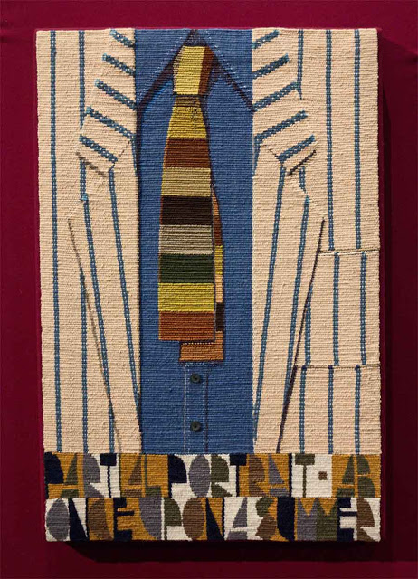
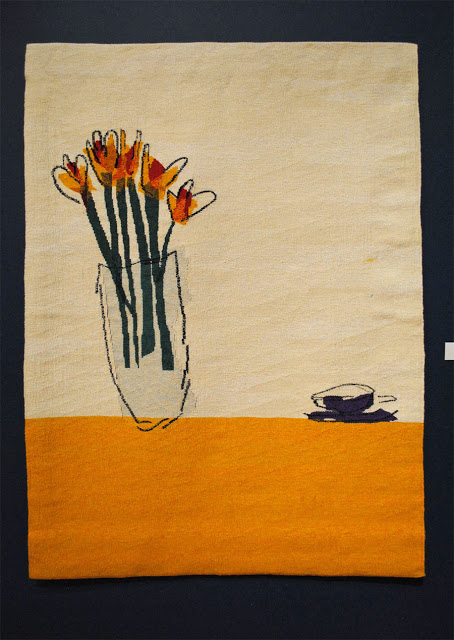
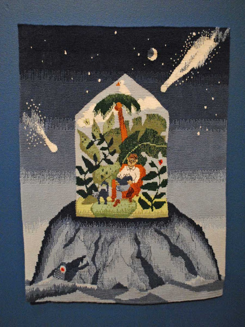
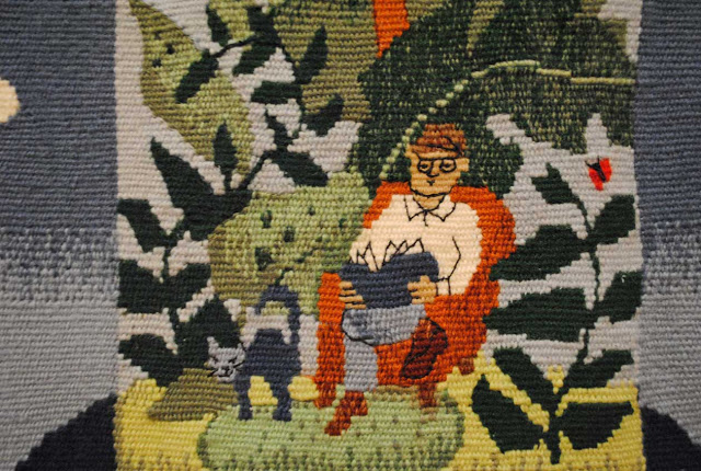
I purchased the catalog from The Art Institute of Chicago’s show of June Wayne’s tapestries in 2010-2011. At this point June was still alive and she wrote a short essay for the catalog. June is best known for her lithography and New Mexicans might recognize the name Tamarind Lithography Workshop which is now housed at the University of New Mexico in Albuquerque. For four years from 1970 to 1974, June focused on creating 12 large-scale tapestries, 11 of which were realized. All are currently exhibited at David Richard Gallery.

Here is a quote from the beginning of June Wayne’s catalog essay entitled, “Sufficient Unto Each Day is the Myopia Thereof.”

In 1973 the International Biennial of Tapestry in Lausanne, Switzerland, rejected one of my tapestries. Mildred Constantine, the curator of design at the Museum of Modern Art, New York, and the chairman of the Lausanne jury, told my Paris dealer that Lame de Choc was “too old-fashioned to show alongside fiber art.” Over the years I have ruminated about the differences between fiber art and tapestry and have come to believe that they are conceptual opposites, although they share the rubric of textiles.
In the 1960s fiber art literally “jumped over the convent wall” into mainstream aesthetics, distinguishing itself from tapestry by the adoption of “fiber” as its key word, which it had a genuine (and practical) need to do. Semantically and factually, tapestry had become a misleading label for the new directions that were being taken in weaving by artists who paired themselves with painting, graphics, collage, assemblage, and all the other artistic subsets that gave the ‘60s its reputation for freedom of expression…. But my art had an agenda that did not fit the goals of fiber. I needed and wanted tapestry techniques whose methodology echoed both benday dots and computer grids, just as it offered me a type of image making through the accretion of modules that I had found in the pores of lithograph stones….

I found it more than a little ironic following this quote and given the fact that the talk was in a gallery stuffed with huge tapestries, that the lecturers did not show one slide of a tapestry, did not talk about June’s tapestries, and that the entire talk was centered around the fiber art of which June says her tapestries had nothing to do with.

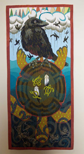
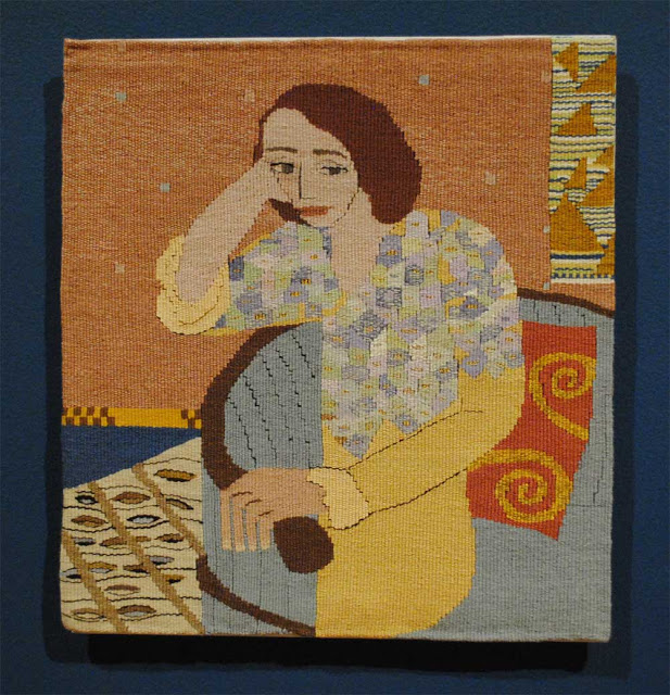
Here are some quotes and highlights from the talk. There was a lot said about Judy Chicago’s work. I was excited to hear more about her history and work while looking at one of her tapestries (The Creation). I also appreciated hearing Judy speak a little bit about her career as an artist. (There is a lot of information out there about Judy Chicago and I will leave it to you to research her show.) I heard far less about June Wayne’s work.

Janet Koplos at the very end of her 20 minute talk and the only mention of tapestry by either speaker until the question period: 

Tapestry, the technique central to the two bodies of work that brought us here today, have somewhat more relation to drawing and painting and thus more easily accommodate specific statements of meaning. It seems that people trained in fiber often looked for ways to work beyond the expectations of that material while people trained in other mediums and techniques looked at fiber and saw the emotional, tactile, and associational values of fiber and use that toward ends that may be also present in their other work such as painting or printing. Interestingly the same thing seems to be happening in clay today…. and it is a reminder that there is never just one approach and even a single medium that can have many facets, it all depends on the ideas and the impulses of the artist.

At the end of the two talks, there was a period for questions. It was clear that the gallery had a large number of fans of Judy Chicago which was not unexpected since the creator of The Dinner Part (and many other famous works of art) was sitting among us, and she does live in New Mexico after all. We were an hour and a half into this experience and I had yet to hear anything substantial about tapestry from anyone except David Eichholtz, the gallery owner and curator who introduced June Wayne’s work at the beginning and the brief statement Koplos made at the end of her talk. So I stood up and asked Koplos and Auther what they thought the connection was between the issues of fiber art’s place in modern art to contemporary art tapestry production. The answer from Janet Koplos was that there isn’t anyone doing contemporary tapestry art any more. This was stunning to me. I sat down with my head spinning… and then all the things the ATA forum I participated in last year rushed back to me and all I could think was that these are the current scholars and curators of fiber art and even they don’t know what we do. Or rather, they know what we do, but they don’t think anyone of consequence does it any more. Here is the exact conversation.

Rebecca:

I am just wondering if you have any comments about contemporary tapestry in relation to the development of fiber art and its place in the art world today.

Koplos:

I think in the art world today there is a place for absolutely anything anybody wants to do. I don’t think there is any limit on it. But the real movement in tapestry, the attention to tapestry, came with the Lausanne Bienniale in the 60s and lots of artists were paying attention to it then but not to the degree that these two women were. You know, they were just somebody who did a cartoon and handed it over to somebody and it was executed by another person, so it was a superficial engagement. But there was engagement with the thing. And now… [she trails off and Auther picks up]

Auther:

The only way I can answer that is I went to the recent College Art Association meeting in New York which is the big interdisciplinary conference that artists and art historians come to. I noticed there was a panel on tapestry and I thought that was really fascinating, but as I looked at the individual papers as the conference came closer, it was really really stuck in 17th and 18th century. And I still feel like scholarship is … there is not the scholarly interest in contemporary tapestry that there should be.

David Eichholtz talked some about the use of digital weaving done by people like Chuck Close and Robert Indiana and questioned the differences between this kind of weaving and the one-of-a-kind hand weaving that created June Wayne’s tapestries. And then Eichholtz mentioned a digital weaving studio in Belgium.

Audience member:

A very well known artist in California these days is a woman named Pae White who does the thing with Brussel’s tapestries and she creates immense installations with Brussel tapestries.  [...]

Auther:

I am glad you brought up Pae White because it just occurred to me that yeah, she is probably the only contemporary artist I know that is doing large scale tapestry where she initiates the process and she is showing in museums that are exclusively devoted to contemporary art. I saw a series of her works in the Scottsdale Museum of Contemporary Art and also I saw a series at SITE [Santa Fe], that must have been two years ago I think? 

Audience member:

They are knock-outs.

Auther:

They are huge and they are really interesting and I have never had a chance to talk to her about the motivations or why she is going into that realm but before that time she worked generally I think with a great interest in fiber and craft traditions.

Unfortunately, Christa Thurman, Chair of Textiles at The Art Institute of Chicago was not able to make it to the lecture as originally planned due to a personal emergency. I would have loved to hear what she had to say. David Richard Gallery has some interviews planned with her and promises to post a series of podcasts and videos with all this information including the talk I heard online. I look forward to Christa’s response to my question.

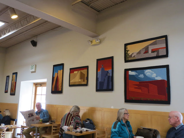
David Richard Gallery did an excellent job getting these speakers and I appreciated the well-attended event. The owners of the gallery were engaging, knowledgeable, and seemed exceptionally supportive of tapestry. I want to thank them for hosting this beautiful show and I hope they will consider showing contemporary art tapestry again in the near future.

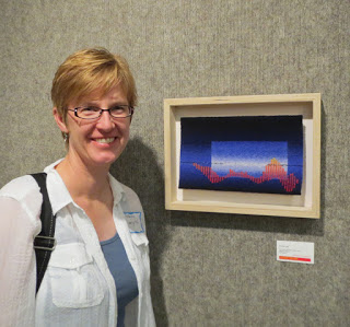
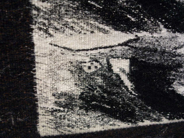
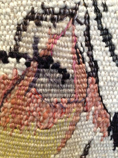
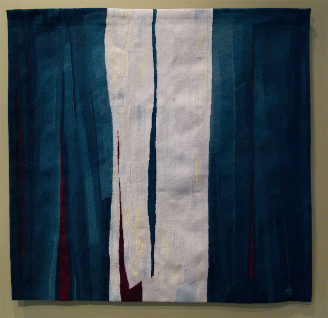
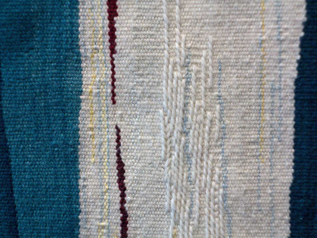
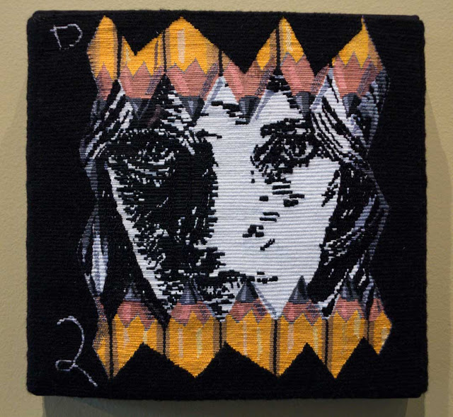
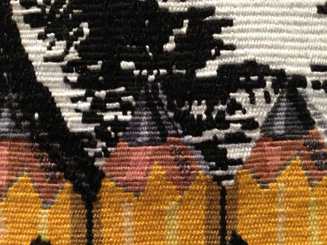
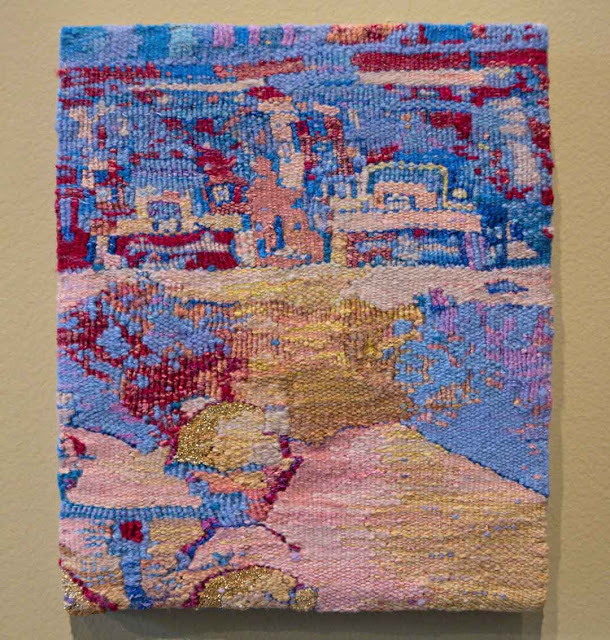
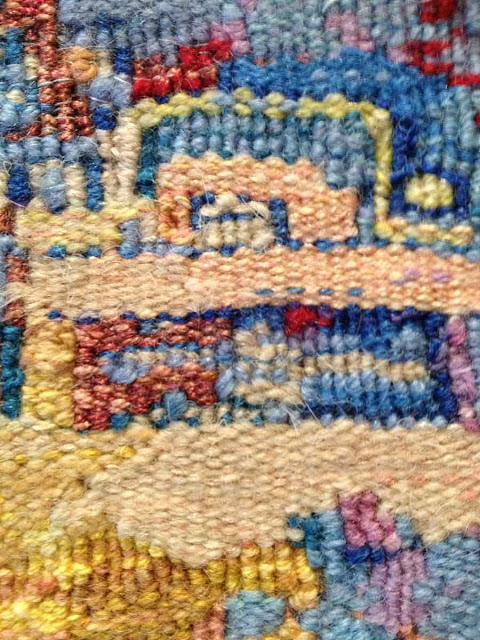
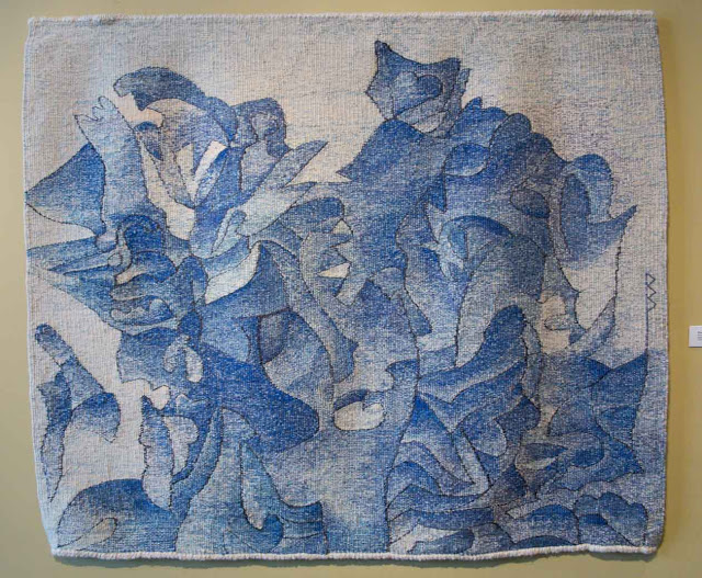
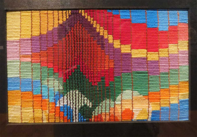
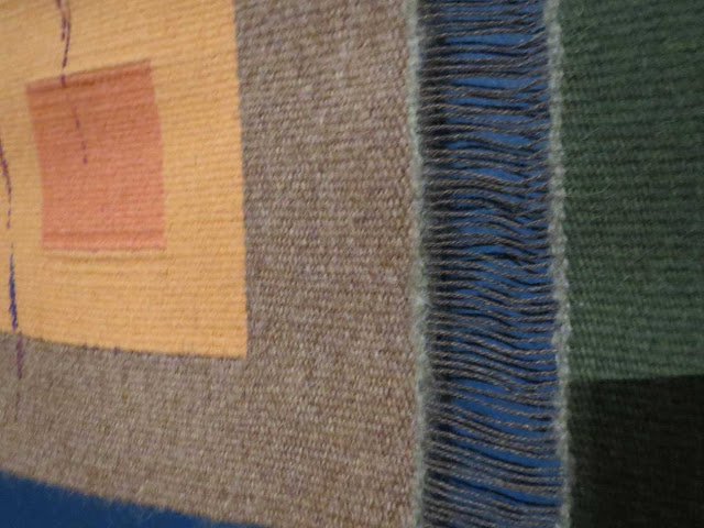
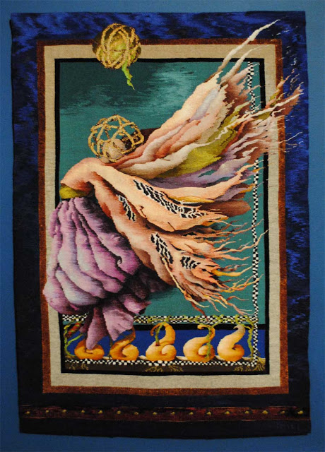
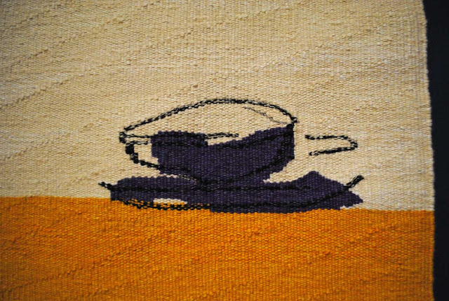
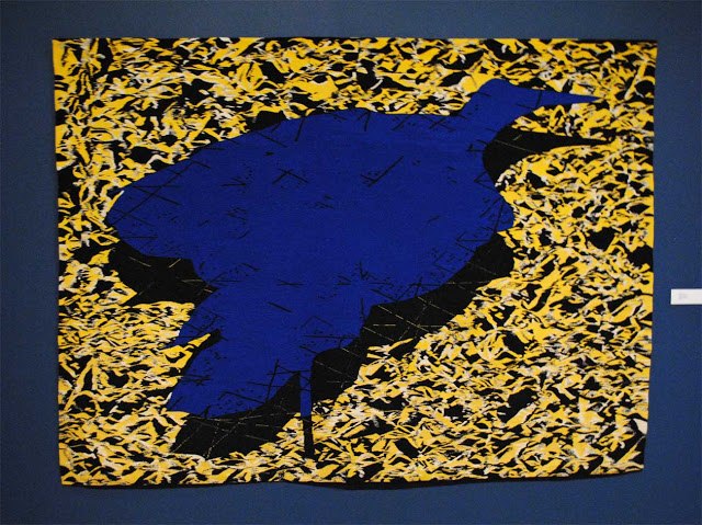
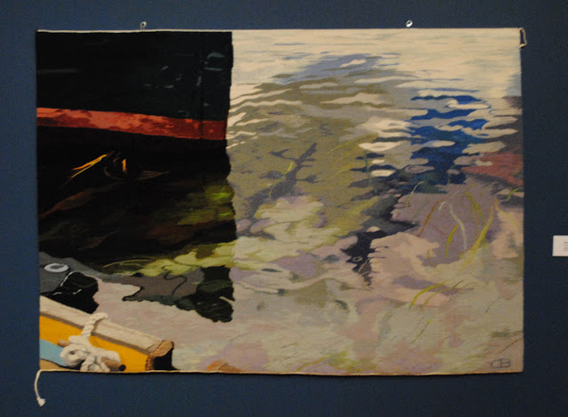
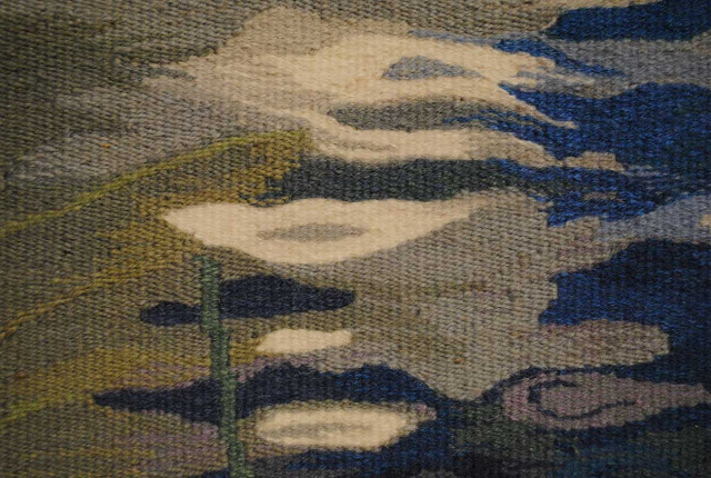
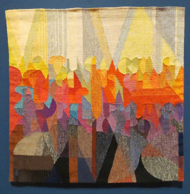
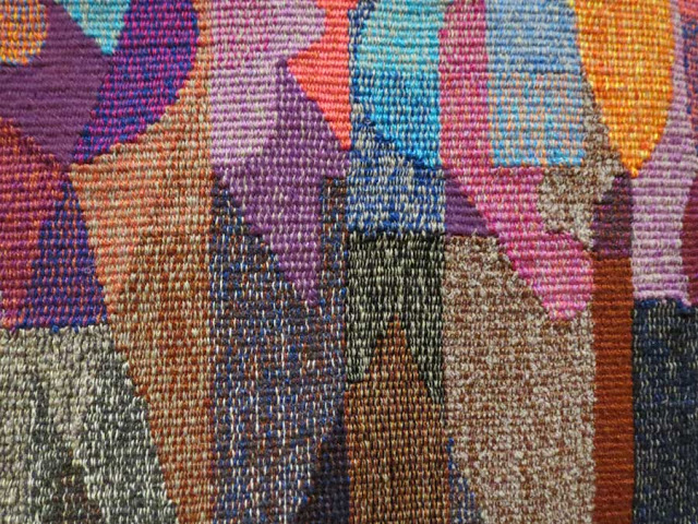
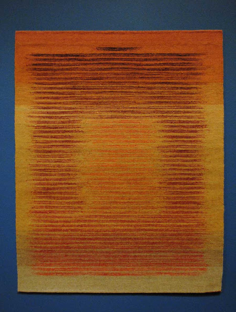
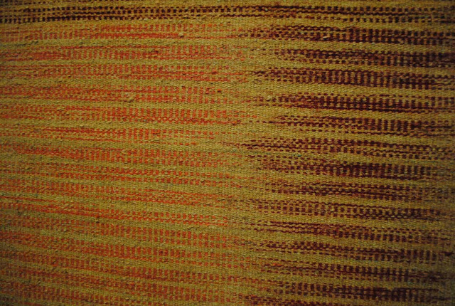
Please visit David Richard Gallery's website and look at the June Wayne tapestries. Or better yet, if you can, go see the show. The tapestries are very large and several of them were stunning. They were woven by three different French studios in the early '70s. My favorite two are The Fifth Wave and VerdictThe Fifth Wave (Cinquieme Vague) was inspired by one of her lithographs, Wave Five. The background consists of irregular blocks that look like they are full of a design from tree rings. I love the color gradation use in this piece.

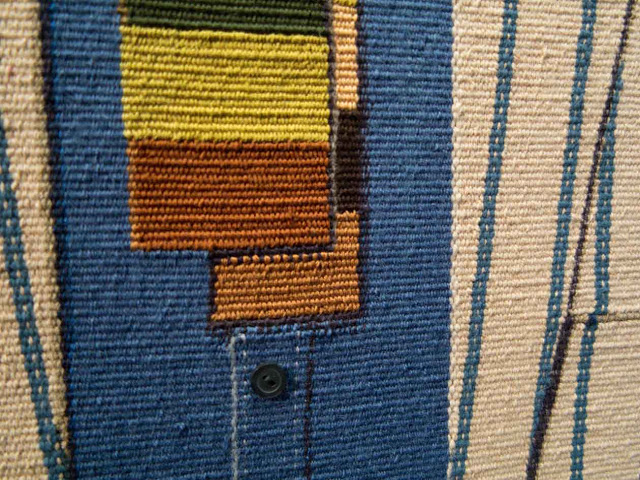
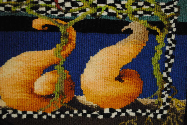
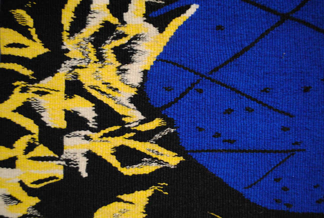
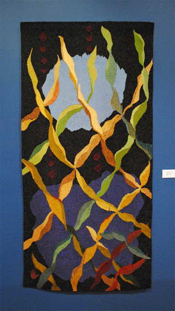
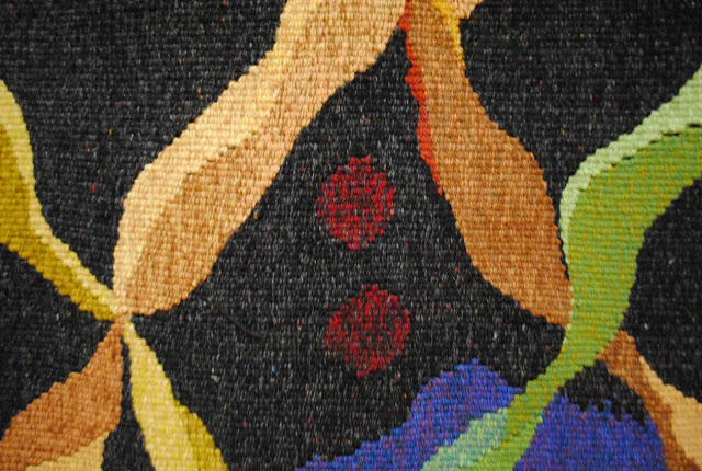
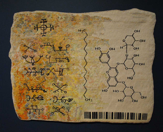
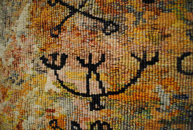
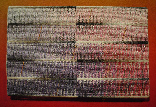
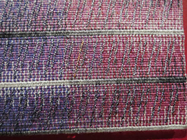
Verdict is 73 by 117 inches and was woven by Giselle Glaudin-Brivet at Atelier Giselle Glaudin-Brivet, Aubusson. The imagery in this piece is also based on Wayne's lithographs and contains references to DNA molecules and mountains. She uses two different warp setts in this piece, adding spots of color through much of it with a double sett.

**********************************************

For more information:

(1) Here is a video of Elissa Auther speaking about her book, String, Felt, Thread: The Hierarchy of Art and Craft in American Art.

(2) Here is a link to a series of photos of Pae White's Untitled, Still from the Whitney Biennial in 2010, a massive "tapestry". I am unable to find much information about her fiber works online but can only assume that these large pieces are digitally produced, possibly in Belgium as people in the talk suggested. This work is what Elissa Auther thought of when talking of contemporary tapestry.

Pae White, Untitled, Still; Whitney Biennial 2010

(3) More information about Judy Chicago at Artsy: https://www.artsy.net/artist/judy-chicago

(4) David Richard Gallery has a series of videos posted on their website. They have a few of June Wayne talking about her work. Here is one of them:

Cinquieme Vague, June Wayne, 86 x 78 inches, Tapestry, 1972

The "missing" tapestries at ATB9

Here at last are the last 16 tapestries from the American Tapestry Biennial 9 at the Fort Wayne Museum of Art. I was heartbroken not to see many of these pieces after traveling from Colorado, but I am grateful to Ellen and Phil Robertson for going to the show, taking these lovely photos, and allowing me to post them for you to see. The placement of the remaining tapestries is in the main hallway of the museum. It is a high-traffic area and so the tapestries should get a lot of viewing. I am pleased that the tapestries are up but wish I had been able to meet Barbara's Sarah Rebecca, Myla's trees, and Dorothy's landscapes in person.
**With apologies to Myla, there wasn't a photo taken of her entire piece. If anyone else went to the exhibit and has one, I'd love to see it. This is one of the pieces I really wanted to study.

As I was unable to view these tapestries myself, I am mostly just going to post the photos with a few comments from the catalog (which can be purchased from the American Tapestry Alliance at this link: http://americantapestryalliance.org/catalogs/).


In the catalog, Archie Brennan states that this is the third "partial portrait" he has done based on styles of clothing he wore in the 1960's, 1970's and 1990's.
Each tapestry focuses on the illusion of contemporary clothing in tapestry weaving that has run through the history of pictorial tapestry over more than 2000 years. Such a subject matter is one of the many themes (words / postcards / line drawing / reconstruction / windows / etc.) that I have focused on since the late 60's.
Partial Portrait-AB-Once Upon a Summer, Archie Brennan; 23 x 15 inches, cotton, wool
Partial Portrait-AB-Once Upon a Summer, detail
Joanne Sanburg says about this piece, "My goal is to communicate a specific personality type with my art and artifacts." I can only chuckle and remember fondly Peggy from ATB8. Thanks Joanne.
Bebe, Joanne Sanburg; 36 x 23 x 1 inch, wool, raffia, twine, silk, cotton, synthetics, embellishments
Bebe, detail
This is one tapestry I have seen before, as Kathy Spoering and I currently live in relatively close proximity (what is 400 miles in the American West? ... to most of us who have lived here a long time, it isn't all that far). It was nice to see the photos of this puppy dog again. Kathy says that this piece is also called 'The Dog Days of Summer' and is one of a series of 12 calendar tapestries she is working on "to categorize the movement and regularity of change in my life.... The 12 tapestries attempt to capture simple moments in time that can represent relationships, passions, or the bits that added together, sum up my changing life." I first saw this piece at the Intermountain Weaver's Conference in Durango, CO and was pleased it was showing again in a bigger show.
August, Kathy Spoering; 18 x 18 x 1.5 inches, wool, cotton
August, detail
I always enjoy Janet Austin's work. This is yet another piece in this show with text in it (see THIS post for the others). Janet says this about the piece in the catalog:
My tapestries grow out of my drawings and paintings. The Chaos series evolved from one 27 year-old painting of my messy studio table. After the usual copying and dismembering, I began to trace a small segment with black colored pencil: in a flash, the fallen cone of yarn morphed into a black hole in the universe. I had found the Chaos I was seeking.
On the Edge of Chaos, Janet Austin; 21.5 x 24 x 1 inches, wool, linen, silk, rayon
On the Edge of Chaos, detail
Here is yet another piece I would have loved to study in detail. Anne Brodersen says in the catalog,
Three things are basic in my work: The daily sense of impressions of strong nature -- the word -- and the material. I try to evoke the essence of the impressions I get from nature in simple idiom. My works often reflect the surface of the big, ragged landscape where everything is constantly formed by the wind. At other times I read the landscape closely, go deep down into the details, use many colors, and the lines and a more delicate technique. Often I work with words as a motive power. I search for a series of strong words, or one powerful sentence. On these I attach associations of form, color and experiences.
I love this description of her way of working. I will have to search out Anne's work in the future.
Departure, Anne Brodersen; 43.7 x 41.7 inches, cotton, linen, wool, silk
Departure, detail
Who can help but love Pat Williams' work. I find it so much fun every time I see photos of it (or once, an actual piece in ATB8). Here is what Pat says about this piece in the catalog:
Thousands of red winged black birds mysteriously fell from the sky onto roads and roofs in Beebe, Arkansas January 1, 2011; over 100,000 fish died at the same time in the Arkansas River. Over 500 black birds died at the same time in Louisiana. On October 11, 2011, there were more reports of dead birds falling from the sky in Sweden, and millions of dead fish have been found in Maryland, Brazil, New Zealand, Italy.
 I would love to know how she does the beautiful edge of the tapestry. I don't have a detail shot of that.
Red Winged Black birds: Memorial to Their Falling From the Sky, Pat Williams; 59 x 21 inches, wool, cotton, lurex
Red Winged Black Birds: Memorial to Their Falling From the Sky, detail
There are a lot of beautiful techniques in this piece. Nancy Jackson says this about it in the catalog:
The primary intent in my work is to look at humanity and the world on a spiritual level with particular attention to human failure and our responses to failure. Images of movement, change and transformation and a sense of being guarded, protected, and nurtured in the process are also important to me. My understanding of being "guarded, protected, and nurtured" does not eliminate suffering and it is not equal to happiness, comfort, and security.
Lakota Creation Myth II, Nancy Jackson; 47.375 x 21.125 inches, wool, cotton
This detail is helpful to me. It appears the tapestry was woven sideways and uses a lot of color blending in the weft bundle as well as hachure technique.
Lakota Creation Myth II, detail
I saw Marie-Thumette Brichard's piece in ATB8 when it was in Lincoln, NE and loved it. This piece is also fascinating. And I love her statement in the catalog:

Today when everything must be done in a great hurry, tapestry may seem to be anachronistic. For me tapestry is an obvious fact, a slow, solitary work, out of time, where creation feeds on technical constraints and the tactile pleasure of weaving, touching the material, intertwining the threads, the rhythm of the spindle sounding like music... All my work is inspired by my maritime environment and mainly the Isle of Groix, its light, its colors, its rocks. 
Glaucophanes et Prasinites 2, Marie-Thumette Brichard; 51 x 51 inches, wool

Glaucophanes et Prasinites 2, detail
Of all the pieces I didn't get to see, I have to admit that missing a meeting with Sarah Rebecca was the worst blow. I am fascinated by Barbara Heller's imagery and her ghost series tapestries. She must use a split warp technique (doubled warp) for the more detailed portions of these tapestries. Here is what Barbara says about this tapestry in the catalog:
With this tapestry I have returned to my ghost images from a new perspective. Sarah, Rebecca, Rachel, and Leah are the four matriarchs of Judaism. My Sarah Rebecca represents all the people dislocated from home by fear or hope. They have traveled through time and space to find a better life and their spirits linger on in their homes and in our memories.
Sarah Rebecca, Barbara Heller; 48 x 70 x 2 inches, linen, wool, cotton, rayon; photograph courtesy of the artist
Sarah Rebecca, detail; photograph courtesy of the artist

I really admire Dorothy Clews' work. Her work exudes earthiness and feels like I imagine her home in Australia feels. I was able to see a few of her pieces in a show she was in in Albuquerque, NM in July 2010. From the catalog for ATB9:
The fragile fragment - a flower, person, a culture - out of place, but nonetheless embedded in harsh antipodean soils that give it a new context. Wherever I have travelled in Australia in the most unlikely environment and climate I have found plants from elsewhere, roses in the black soils of the Queensland outback and pansies in the harsh red soils of the Northern Territory sometimes thriving, sometimes not. My own gardens have been planted with exotic plants mixed with natives. These precious fragments of memory make their own story of adaptation and relocation, in the space between one place and another on the opposite sides of the globe creating a new antipodean landscape.
Antipodean Landscape, Dorothy Clews; 9 x 6.75 x 0.5 inches, seine twine, raffie, antique tapestry
Antipodean Landscape, detail
I love the pencils in this image as well as the wonderful framing of the face. Deann Rubin talks about this tapestry being part of a "series of small tapestries reminiscent of vintage children's blocks.
Draw/#2 Pencil, Deann Rubin; 10 x 10 x 1.4 inches, cotton, wool, silk, other materials
Draw/#2 Pencil, detail

Mary Kester says this about her work in the catalog:
My tapestry images are visual responses to the enigma of Neolithic stones. Standing stones are objects unexplained by written language and affected by elapsed time. Their shapes, purposes, and the meanings of their inscribed symbols are outside our frame of reference. My vision of them leads me to build them back, to rearrange them, to place their symbols as I will to evoke their potent presence. I respond to what I've seen with fiber forms in the visual language of texture, shape, color and the illusion of depth.
Broken Lintel, Mary Kester; 54 x 62 x 4 inches, wool, cotton, linen
Broken Lintel, detail
I don't have a photo of Myla Collier's Urban Forest (17 x 52 x 1 inch, wool, cotton). If anyone goes to the show and takes one, I'd love to see it. I think the first detail shot is fabulous. Myla says this about her work:
My recent work has focused on woven interpretations of the lush landscapes and environment of my hometown, San Luis Obispo on California's Central Coast.
Urban Forest, detail
Erica Lynn Diazoni provided a poem with this piece in the catalog.

Thoughts
are small stones.
I pick them up, like pebbles on the beach.

I put them in my pocket.
As I roll them between my fingers.
I simply notice and take delight.
Here smooth, here rough
This one cold, this one warm.

I take the pebbles back out
Setting them carefully
back on the sand
And marvel at their raw beauty
gleaming back at me.
Psyche, Erica Lynn Diazoni; 5.11 x 6 inches, wool, cotton
Psyche, detail
Suzanne Pretty:
The modern landscape often contains elements of the natural world juxtaposed to the world of technology and machines with its flash and glitter. Construction trucks are parked in a tidy row at the road side ready for the next day's work. The patterns are very different from the William Morris patterning of vines and birds. These trucks create patterns with harsh colors and chrome pulsing with power. These scenes, juxtaposed and infringing on the natural landscape, occur at a rapidly increasing rate. In my work I focus on these intersections at the very edges with the contrast and blend of the elements.
Road Construction in Detail, Suzanne Pretty; 9.4 x 7.9 inches, wool, silk, cotton, linen
Road Construction in Detail, detail
Bozena Pychova:
My tapestries are always based on my own designs and I weave the vertical way to see the whole composition. The characteristic sign is my enchantment by a line and depth of the colorful spaces clustered in changing configurations. The tapestry "Blue Prelludium" also had a colored design - a simple drawing. During the realization, I used streaky strands of different thickness according to the needed tint. I let this material go through the warp. The strands appear only where the material allows it, which brings inspirational moments to me. In the case of this tapestry, I also started to improvise with color spaces and their tonal values and I played with them like with musical tones, which gave the title to this piece of work.
I love how she blends the blues which you can see in the detail.
Blue Prelludium, Bozena Pychova; 59 x 67 inches, wool
Blue Prelludium, detail
When I started posting the photos from this show, I never intended to show every single tapestry. But now it looks like I almost have. My perfectionistic tendencies have reared their head again, but hopefully it has been useful to people who didn't get to see the show at all. I realized when looking back that I missed a few tapestries from the initial group. Here they are, these photographs are mine.

This tapestry by Tori S. Kleinert reminded me of a quilting method I tried once which I think is called Bargello. I like the movement of the blocks and the curved forms at the bottom. This piece was behind glass and was difficult to photograph.

Semblance of the Ancient Ones, Tori S. Kleinert; 5 x 7.75 x 1 inches, cotton, linen

This piece was woven sideways and had the interesting feature of empty warp threads between the squares. Carol Chave says in the catalog, "After Albers," five linked tapestries, was inspired by Josef Albers' Homage to a Square series. (Tapestry in the distance is DisConnect by Linda Wallace.)

After Albers, Carol Chave; 18 x 86 inches, wool
After Albers, detail
The fiber in this Barbara Burns piece was very shiny cotton which made a photograph difficult. The expression is well done and this piece is on the back of the catalog.
Little Spinner Girl, Barbara Burns; 13 x 13 inches, cotton
Ann Booth:
Recently I have been working on a series of portraits I call my Sheroes (female heroes). Women who have been strong role models along my spiritual journey.
I like the way Ann uses shapes in her pieces to move color and create background as in the surface behind the figure in this tapestry.
Munirih Khanum, Ann Booth; 25 x 26 inches, wool, cotton
Munirih Khanum, detail

 Helen Gold:
Sometimes I look to the past for inspiration for a tapestry project. Seated Woman is a tribute to the barrier breaking modernist art forms of Fauvism, Cubism and Art Nouveau. The women, textiles and interiors of that period are the spirit of this tapestry.
Seated woman, Helen Gold; 19 x 17.5 inches, wool, cotton
Seated Woman, detail

The End

(for the moment)

The last of the ATB9 shots... for now.

Here is the last batch of photos from the American Tapestry Alliance's American Tapestry Biennial 9 (ATB9) show at the Fort Wayne Museum of Art. I do hope to see someone's photos of the missing tapestries when they are up though!

***This just in! I was able to get some good photos from a wonderful student who will let me post them. I will get those photos up this week so you can see "the missing" tapestries.

This is the last in a series of blog posts about this show. Click these links to read the others:
A Call to Action for Tapestry Artists
American Tapestry Biennial 9
ATB9 goes New Mexico
The shape of tapestry and ATB9
It's all Sarah's fault (and more ATB9)

Linda Wallace's piece DisConnect won one of the Teitelbaum awards. I loved studying this piece. The color use is wonderful with beautiful gradations in the forms (see detail below). The colors in the borders change as you look around the piece (and I can't swear to it, but I think she used some chenille in the rich brown parts). Her technique is wonderful and the imagery about women and cultural burdens is engaging.
DisConnect, Linda Wallace; 48 x 32 x 1 inch, wool, cotton, linen, silk, metallics
DisConnect, detail
Thomas Cronenberg's tapestry is one I have been waiting to see. I love the drawing-like lines and the simplicity of the piece. And I loved finding secrets in it I couldn't see in the catalog photo.
Daheim (At Home), Thomas Cronenberg; 61 x 43.7 inches, linen, wool, silk, mercerized cotton
Daheim (At Home), detail
Lialia Kuchma's piece Crane is large and fortunately they hung it in a spot I could stand back and look at it. I loved the flat but intense blue of the crane figure. The yarn had no variation in it except up near the head and the intenseness worked well in this piece. The flat plane is broken up with black lines which give it a little motion. The background field is hugely textured and interesting in itself.
Here is what Lialia says about this tapestry in the catalog:
regarding the tapestry CRANE -- during the period of disquiet in Ukraine, especially after the disappointment of the last election I felt compelled to give substance to this concern. thus the crane, a symbolic and popular image in Ukraine-the blue shape of the crane defined in its boldness on a heavily textured field appears to hover in a stasis over a geography of a restless history.
Crane, Lialia Kuchma; 63 x 87 inches; wool, cotton
Crane, detail
Cecilia Blomberg's piece was one that I looked at several times before I felt at ease with it... and then challenged again. It is both abstract and realistic and I finally felt like I could see the water and the boat as a realistic portrayal and then shift back into the more abstract work I saw when I first looked. It is a lovely piece.
Mates, Cecilia Blomberg; 35 x 49 inches, cotton, wool, linen
She used a lot of eccentric weft in the water.
Mates, detail
Alex Friedman's Macondo is about the Deepwater oil rig disaster in the Gulf of Mexico in April 2010. Alex writes in the catalog,
'Macondo' represents both the subjective and environmental dark forces that obscure the clear waters. The oil dispersants used are banned in parts of the world. How long these toxins remain and what the eventual damage remains to be seen. However, in time, nature has a way of overcoming these adversities and my hope, symbolically represented by the bright green tips of the sea plants, is that there will be some restoration of the natural order.
Macondo, Alex Friedman; 72 x 38 inches, wool, cotton

Macondo, detail
Becky Stevens' Home Safe Home made me think of being wrapped in my house (probably reading a book and absorbed in some imaginary land) while the cold night and sea monsters roamed outside.
Home Safe Home, Becky Stevens; 24 x 18 inches, wool
Home Safe Home, detail
Elizabeth Buckley's Dialogues Through the Veil also bears mention. It is also a lovely piece with outstanding technique and wonderful secrets that you see the more you look at it. You can see her piece on the ATA website at this link.


I am including the video of the show here again in case you missed it the first time.


It is all Sarah's fault (and more ATB9)

I tend to like tapestries that use text in some way.  I mostly blame this on Sarah Swett and her slow literature tapestries because I was in love with them immediately--and I've only seen photos on her website. There were quite a few pieces in the American Tapestry Alliance's ATB9 at the Fort Wayne Museum of Art which used text or the idea of text in the work. So here I go with another set of photos from that show...

I look a lot at how people blend color in weft bundles. This piece by Lindsey Marshall has multiple colors in every weft bundle throughout the piece. You can see this in the detail below quite well. I love the abstracted typographic forms she uses.
When Fortune Flowers--Lindsey Marshall; 22.5 x 22.5 cotton, linen, metallic, acrylic

When Fortune Flowers, detail
Tara by Michael Rohde is one of my favorite pieces from the catalog. It did not disappoint me in person. The surface is alive and so rich. I think this likely has something to do with the natural dyes as well as a rougher wool than I use. The use of pick and pick to make the text-like figures is enchanting. I love how the colors grade throughout the piece.
Tara, Michael F. Rohde; 45 x 36.5 inches, wool, natural dyes

Tara, detail
Here is another text piece with both implied and actual text in it. Marzena Ziejka's Declaration of Independence is wonderful. Look carefully at the details. The text at the top ("Congress" in the detail) is woven right in and readable as such. The text farther down is mostly just suggested. But when you stand back and look at the whole piece, you are convinced that there is text throughout. Look at the second detail. It is done with soumack that is slanted consistently to look like cursive writing. The whole piece looks like a piece of parchment with color changes, cracks made by sewing with darker thread, and uneven-looking edges (they are actually very straight) done with darker edges in part, a difficult weaving trick!
Declaration of Independence, Marzena Ziejka; 50 x 43 inches, hand-spun, hand-dyed wool, linen
Declaration of Independence, detail
Anne Jackson's piece is also wonderful. Her color use bears some study and you can see some of it in the detail below. The symbols are beautifully done and, according to the catalog, are a mix of magical signs and diagrams from biochemical research.
The Witchcraft Series: Alchemists, Anne Jackson; 28 x 37 inches, cotton, linen, synthetics

The Witchcraft Series: Alchemists, detail
Anne Jackson's piece reminds me of a postcard. Tricia Goldberg's piece actually was inspired by a postcard.
Postcard for Angela, Tricia Goldberg; 60 x 39 x 1 inch, cotton, wool, silk
Postcard for Angela, detail
The last piece of this text-related group of tapestries I wanted to show you is Etude 3 by Joyce Hayes. I love the beautiful lines in these pieces Joyce does. The changes in value in the colors as well as the beautiful slanting lines do make me hear music. This piece is very small and the intimate viewing distance required adds to the enchantment.
Etude 3, Joyce Hayes; 8.5 x 9.5 inches, linen, cotton, poly sheen soumak
Etude 3, detail
These text pieces are interesting to me for many reasons. I think I like the regularity that text can create. I love the association with my favorite pastime, reading. I think about my father's type cases full of old type and his printing press running on a Saturday morning, the odor of printers ink filling the air of his shop. And I think about all the books I have yet to read in my life and what that really means to me. Text is beautiful. Especially when woven.